Ultimate Guide to Magazine Paper Tips for Perfect Printing?
When it comes to printing quality magazines, understanding magazine paper is essential. The choice of paper can greatly affect the final product. Different types of magazine paper have unique textures, weights, and finishes. These factors play a significant role in how vibrant colors appear and how images are perceived.
Selecting the right magazine paper can be overwhelming. It requires careful thought about your target audience and the magazine's purpose. For example, glossy paper often enhances photography, while matte finishes provide a more subdued and elegant look. However, the choice is not always straightforward. You may face challenges in balancing budget, quality, and desired aesthetics.
As we explore the realm of magazine paper, several considerations emerge. Does the paper suit your magazine’s theme? How does it impact the reader’s experience? The answers may not be clear-cut. Experimentation and refinement are often necessary. Understanding these details is crucial to achieving the perfect print.
Understanding Different Types of Magazine Paper: A Comprehensive Overview
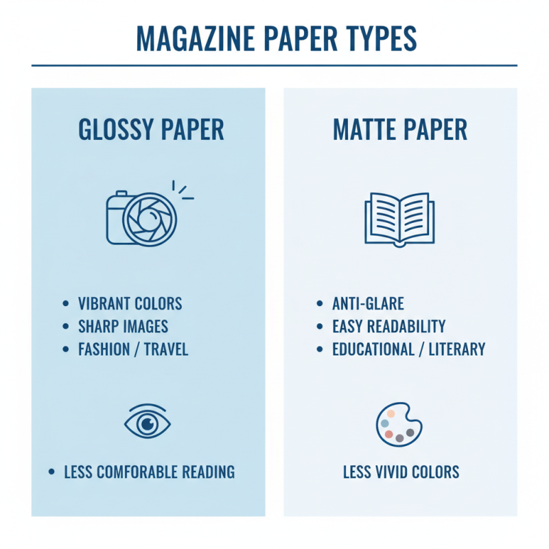
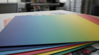
When selecting magazine paper, understanding the different types available is crucial. Each type of paper serves a unique purpose. Glossy paper offers vibrant colors and sharp images, ideal for fashion or travel magazines. However, it may not always provide a comfortable reading experience. Matte paper, on the other hand, prevents glare and enhances readability. But, it can make colors appear less vivid.
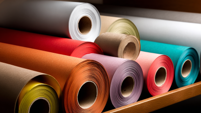
Consider the weight of the paper as well. Lighter paper can reduce printing costs and make magazines easier to handle. Yet, it may feel flimsy and less premium. Heavier paper can give a luxurious feel but may increase mailing expenses. Some magazines opt for recycled paper to appeal to eco-conscious readers. While this choice reflects sustainability, it can sometimes lead to variations in color and texture.
Texture is another vital factor. Textured paper adds depth to images, creating an engaging visual experience. However, it can complicate the printing process, leading to uneven ink distribution. It's essential to weigh these factors carefully. Choosing the right paper type involves balancing aesthetic appeal with practical considerations. Testing samples before final decisions can help avoid potential mistakes.
Factors to Consider When Choosing Paper for Magazine Printing
Choosing the right paper for magazine printing can be challenging. Many factors come into play. Print quality is crucial. Glossy paper enhances colors but may reflect too much light. Matte finishes provide a softer look but can absorb ink differently.
Consider the weight of the paper. Standard magazine paper ranges from 50 to 100 gsm. Lighter paper feels less substantial, while heavier options give a premium feel. Think about durability as well. Thicker paper can withstand handling better, but it may increase printing costs.
Texture also matters. A smooth texture can help sharp images pop. However, it may not be ideal for all designs. Some prefer a textured finish for a unique touch. Remember, every choice impacts the final product. Reflect on what your audience will appreciate. Balancing aesthetics and practicality can be tricky. Aim for a choice that aligns with your vision and budget.
Ultimate Guide to Magazine Paper Tips for Perfect Printing
Tips for Achieving the Best Print Quality on Magazine Paper
Choosing the right magazine paper is crucial for print quality. Non-coated paper often absorbs ink differently than coated paper. This can lead to variations in color saturation. When using uncoated stock, you may notice that colors appear muted or washed out. Make sure to test samples before committing to a large print run.
Inks play a significant role in the final output. Water-based inks can behave inconsistently on certain surfaces. If your paper isn't compatible, you might struggle with drying times. This could lead to smudging or bleeding, diminishing your magazine's appeal. Keep an eye on drying conditions to avoid these issues.
Finally, consider the weight of the paper. A heavier weight may feel more luxurious, but it can pose problems during folding and binding. Lighter weights are easier to handle but may sacrifice durability. Balancing quality with practicality is key. Regularly revisit your choices to assess how they impact the overall print quality. This reflection can lead to better decisions in future projects.
Common Printing Issues and Solutions for Magazine Paper Projects
When working on magazine paper projects, printing issues can arise unexpectedly. One common problem is paper jams. This often happens due to incompatible paper thickness. Ensure that your printer supports the type of paper you use. Adjust the paper guides properly to avoid misalignment. Ignoring these aspects may lead to wasted ink and ruined prints.
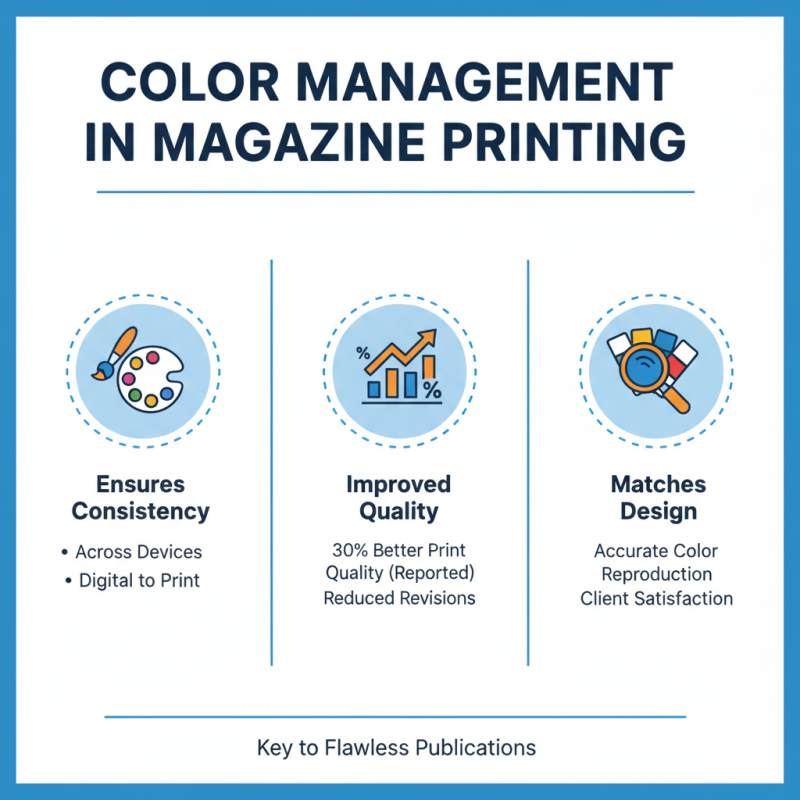
Another issue is color consistency. Sometimes, colors appear differently on screen and paper. This discrepancy can be surprising. Always test prints before the final run. Print a sample page to check color accuracy. If colors look off, consider calibrating your monitor. Also, use color profiles that match your printer settings. This may help achieve the desired look, but perfect accuracy may still elude you.
Lastly, keep an eye on ink saturation. Excessively saturated colors can bleed, ruining the overall appearance. But low saturation can make your print look dull. A balanced approach is essential. Test various ink levels on your printer using different paper types. Find a sweet spot that works, but be prepared for trial and error along the way. Adjusting ink settings may take some time, so patience is key.